.gif)
Next
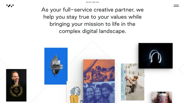
Do you want to grab attention, keep it and convert visitors in one go with landing page design? We’ve got you! Use these 5 secret tips to design for high engagement and interactivity.
5 Secrets to Designing a Highly Interactive Landing Page
Creating a landing page that grabs attention and encourages action is a must have essential part of every website design strategy.
It’s no longer enough to just look good- your website needs to engage users and guide them towards a specific goal. Whether that’s signing up for a service or downloading a free resource.
So, what’s the trick to building a landing page that really captivates users?
Follow our five key secrets to designing a highly interactive landing page that turns passive visitors into engaged conversions.
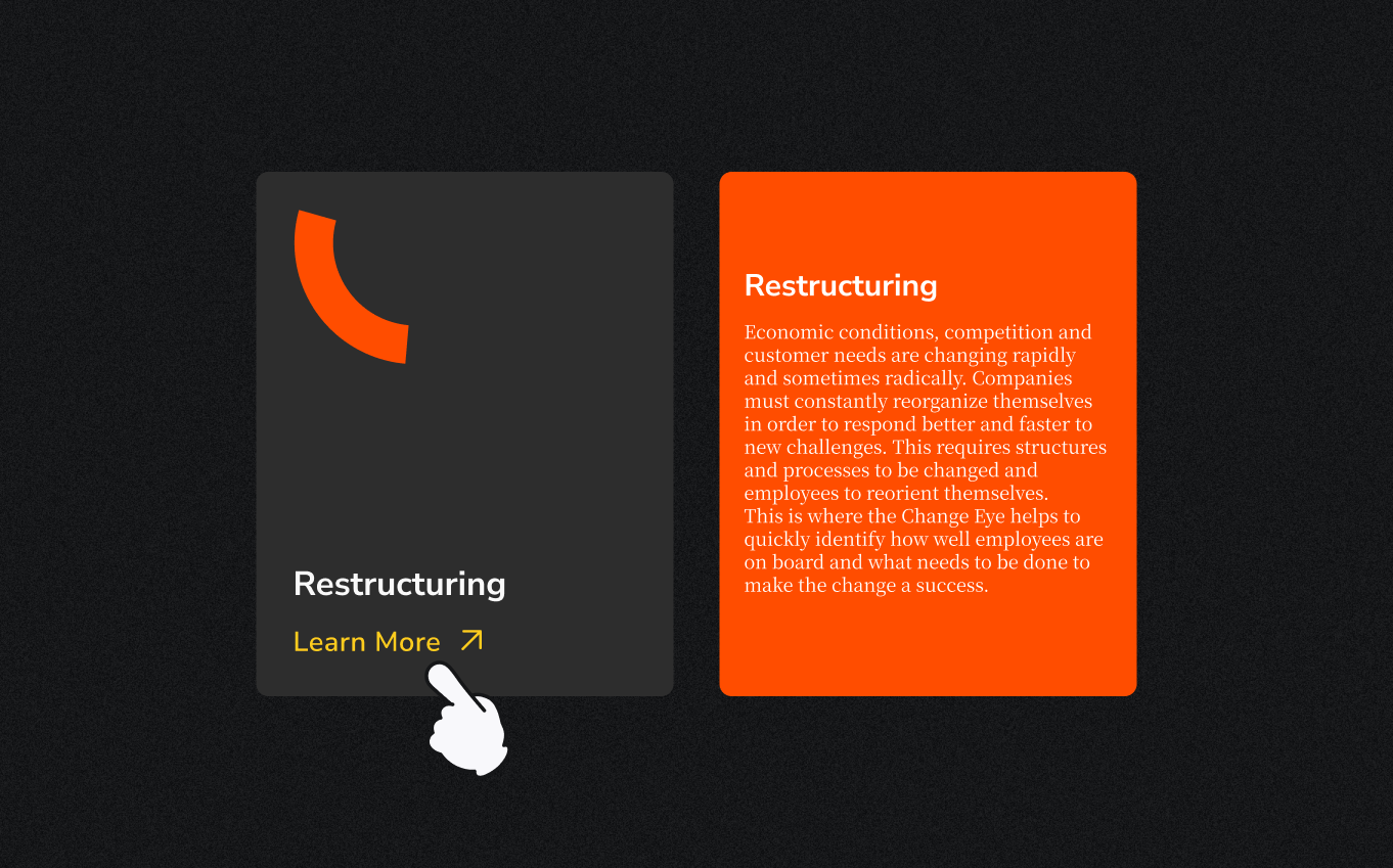
1. Make the Path Clear and Simple
When a user lands on your page, they shouldn’t have to guess what comes next. Overwhelming them with too much information or too many options is a quick way to lose them. Instead, guide them step-by-step with a clear, focused layout.
Less is more. Keep the design clean and ensure the call-to-action (CTA) buttons are obvious and prominent. If users are faced with too many choices or distractions, they’ll likely leave before completing any action.
Pro tip: Hide the ‘fluff’ details behind clickable sections or tooltips, so users can explore more without being overloaded right away. Once they’re hooked they’ll navigate back to these info-rich sections.
2. Use Micro-Interactions to Keep Users Engaged
Ever notice how a button changes color when you hover over it? Or how a form lets you know instantly if you’ve made a mistake? These are examples of micro-interactions- small, responsive details that create a sense of interactivity and help guide the user experience.
Well placed micro-interactions give users instant feedback, making your landing page feel alive and intuitive. A subtle animation or visual cue reassures users that their actions are having an effect, which keeps them engaged.
Pro tip: Add these interactions to buttons, links, and form elements. For instance, make your CTA button pulse slightly when hovered over to encourage clicks.

3. Personalize the Experience with Dynamic Content
A one-size-fits-all approach can feel impersonal. Users are more likely to engage with content that feels like it’s tailored to their needs or behavior. Dynamic content helps by adapting parts of the landing page based on who’s visiting or how they’ve interacted with your brand.
Personalization through interactive elements makes users feel understood. A simple example could be a quiz that leads them to customized product recommendations, or a calculator that shows exactly how your service will benefit them.
Pro tip: Use data like location, past visits, or preferences to show the most relevant content or offers right from the start.
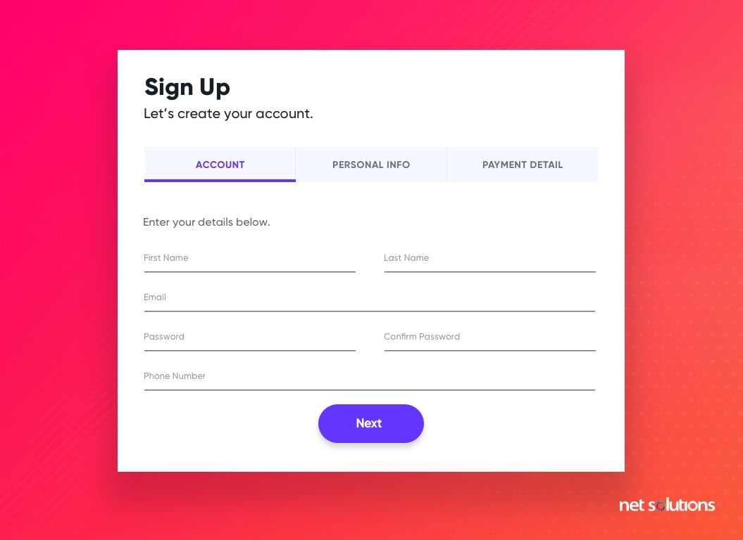
4. Streamline Forms with Instant Feedback
Forms are often where the magic happens- users fill them out, and you get a lead or sale. But if your form feels long or complicated, users will abandon it.
The key is to make forms easy and intuitive with real-time validation that gives users feedback as they go.
Keep it short and sweet, and only ask for the essential information. Give users live feedback, like a green checkmark when they enter the right details. This reduces frustration and speeds up the process.
Pro tip: Break up long forms into sections and add a progress bar. Users feel more motivated to complete a form when they see how close they are to finishing.
5. Bring Your Page to Life with Interactive Visuals
Static images and walls of text can only do so much to capture attention. Instead, consider using interactive visuals, videos, or animations to convey your message. These elements can help break down complex ideas and make the experience more engaging for the user.
Interactive visuals should be eye-catching but not overwhelming. For example, an infographic that responds to scrolling or a short video explaining your product can keep users interested without bogging down the page.
Pro tip: Make sure your visuals are optimized for mobile devices and won’t slow down your page load time to avoid drop offs. Fast, responsive visuals are key to keeping users engaged.
Our Final Thoughts
Designing an incredibly engaging and highly interactive landing page is all about balance. Start with the goal in mind of creating an experience that’s visually appealing, functional, and engaging. And remember, don’t overwhelm the user.
Through a simplified user journey, micro-interactions, personalizing content, optimizing forms, and using dynamic visuals, you’ll create a page that not only looks good but also drives meaningful action!
We’d be so stoked to partner with you!