.svg)


.gif)
Next
Design apps and websites that demand engagement! We’re cutting through the proverbial noise and digital clutter to give you an inside scoop behind our top UI and UX design go-to’s.
Have you ever been frustrated with an app that seems impossible to figure out? Or maybe a website with buttons that disappear when you try to click them? These are prime examples of poor UI (User Interface) design leading to a negative UX (User Experience).
But, we’ve got good news! There are well established principles for crafting UIs that are not just functional, but enjoyable and engaging to use. We’ve outlined some key UI concepts, exploring practical ways to implement them- we’re focusing on mobile responsiveness, accessibility, intuitive navigation, and ultimately, user satisfaction and engagement.
While UI and UX are often used interchangeably, they represent distinct aspects of user interaction with a product.
User Interface (UI), refers to the visual elements and functionalities that users directly interact with- like buttons, menus, and screen layouts. It's the aesthetic and technical layer users perceive.
User Experience (UX), encompasses the broader sense of how a user feels while interacting with the entire product or service. This includes factors like ease of use, clarity of information, and overall satisfaction.
UI is a crucial part of UX, but UX considers the entire user journey, from initial impression to post-interaction feelings. Imagine UI as the stage set for a play, and UX as the entire production- including the script, acting, and audience experience.
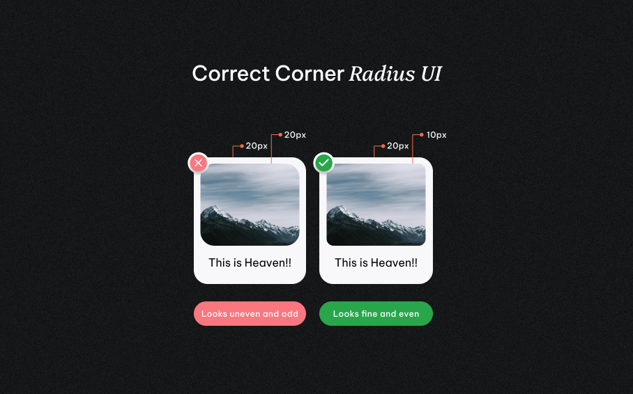
So, with that in mind- can imagine walking into a foreign country where all the signs are in an unknown language… that’ll be pretty confusing, right? This is precisely how users feel when confronted with unclear UI elements. Here's how to achieve clarity.
Example: We love AirBnb’s visual clarity! They use clear and simple icons when searching for different types of accommodations. They also priorities large, high-quality photos to showcase listings.
If traffic lights suddenly changed color meanings at every intersection, traffic would be plunged into chaos! Which is why consistency is key! In UI design fostering trust reduces the need for constant re-learning.
Example: A favorite of ours for this is Google Drive. They maintain a consistent look and feel across all its platforms, whether you're accessing it on a desktop, laptop, or phone. Buttons and menus function the same way regardless of the device.
A truly exceptional UI caters to a diverse range of users, including those with disabilities. And at our design studio, inclusivity is non-negotiable! Here's how to ensure you’re designing for everyone.
Example: Check out BBC News website. They’ve got a brilliance interface that works seamlessly with screen readers, allowing visually impaired users to navigate the news articles and access information with ease.
This is incredibly important! Today's mobile-first world dictates that a responsive UI is no longer an option, it's a necessity. Here's how to ensure your UI translates seamlessly across devices.
Example: Check out Apple’s website on your different devices, they’re a master of responsive design. Their website adjusts to any device, providing users with an optimal viewing experience on desktops, tablets, and smartphones.
Great UI design anticipates user needs and guides them effortlessly towards their goals. Here are some tips for intuitive navigation.
Example: You’ll find that 99% of major websites have navigation bars at the top of their pages and the footer. Another important note when browsing through different clothing pages, a breadcrumb trail appears at the top of the page's URL. This trail shows the user's navigation path.
By prioritizing these fundamental UX and UI design tips, you’ll create interfaces that are highly functional, and a breeze to use. And remember, have fun while you’re at it! That’s a core value we place at the heart of our designs.
Related blogs