
Next
Color creates a powerful context for emotional experiences and holds the ability to trigger chain reactions in our subconscious mind that guide and influence our conscious thought processes. Learn how to use color theory effectively in your designs to enhance user experience.
Color is a pivotal part of every element developed during the design process. The brilliance of color serves as a powerful tool, deeply influencing how users navigate, interact with, and feel about an experience.
By understanding the complexities of color theory and applying its core principles, you can significantly enhance how users engage with a product, website, app, and more.
Let’s explore the bold impact of color theory on user experience. We;re emphasizing the importance of aligning colors with your design goals and brand personality, while optimizing their psychological effects on users.
Understanding Color Theory
At its core, color theory encompasses the relationships between colors, how they mix, and their psychological implications.
The color wheel, which includes primary, secondary, and tertiary colors, serves as a foundation for understanding color combinations and harmonies.
Key Components of Color Theory
Color Wheel
Primary Colors: These are the foundational colors that cannot be created by mixing other colors. In traditional color theory, the primary colors are red, blue, and yellow. In additive color systems (like digital screens), they are red, green, and blue (RGB).
Secondary Colors: Formed by mixing two primary colors. For example, mixing red and blue creates purple, blue and yellow make green, and red and yellow produce orange.
Tertiary Colors: Created by mixing a primary color with a secondary color, resulting in hues like red-orange, yellow-green, etc.

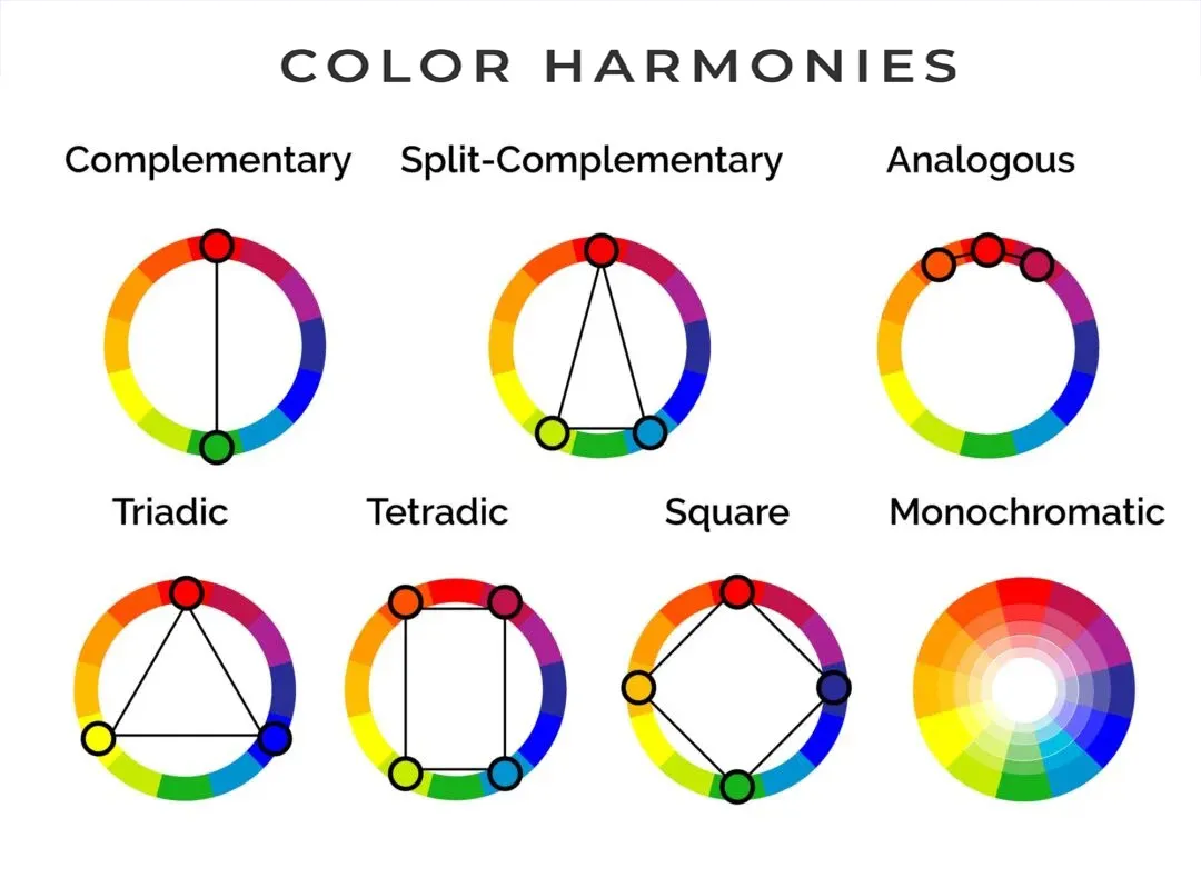
Color Harmonies
These are pleasing arrangements of colors based on their positions on the color wheel.
Complementary Colors: Colors opposite each other on the wheel (e.g., blue and orange). They create high contrast and vibrant looks.
Analogous Colors: Colors next to each other on the wheel (e.g., green, yellow-green, and yellow). They usually match well and create serene designs.
Triadic Colors: Three colors that are evenly spaced around the wheel (e.g., red, yellow, and blue). They offer strong visual contrast while retaining balance.
Split-Complementary Colors: A base color and the two colors adjacent to its complementary color. This provides high contrast with less tension than complementary schemes.
Tetradic (Double Complementary) Colors: Two pairs of complementary colors. This scheme offers plenty of possibilities for color variation.
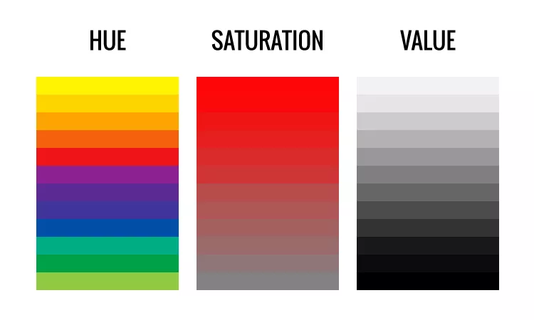
Color Properties
Hue: The actual color perceived (e.g., red, blue, green).
Saturation (Chroma): The intensity or purity of a color. High saturation means the color is vivid, while low saturation results in a more muted or grayish appearance.
Value (Brightness): How light or dark a color is. Adding white to a color creates a tint, while adding black creates a shade.
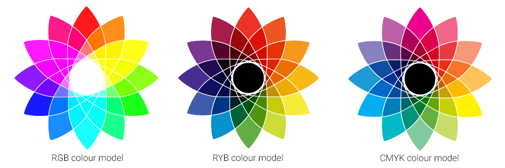
Color Models
RGB (Red, Green, Blue): An additive color model used primarily for digital screens. Colors are created by combining these three light colors.
CMYK (Cyan, Magenta, Yellow, Key/Black): A subtractive color model used in color printing.
HSV (Hue, Saturation, Value) and HSL (Hue, Saturation, Lightness): Models that describe colors in terms more aligned with human perception.
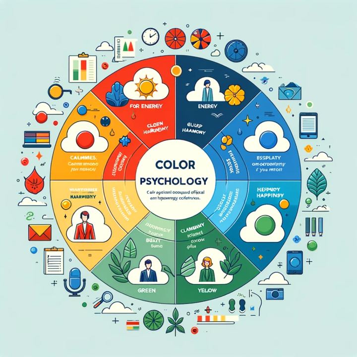
Psychological Effects of Color Colors
These can evoke emotions and influence user behavior, common examples of this are:
Red: Energy, passion, urgency.
Blue: Calmness, trust, professionalism.
Green: Nature, growth, tranquility.
Yellow: Happiness, optimism, attention-grabbing.
Purple: Luxury, creativity, spirituality.
Aligning Colors with Design Goals and Brand Personality
The ultimate objective of leveraging color when designing user experiences should be a process that strategically aligns to the overall design goals and speaks to the heart of a brand’s personality.
It’s important to remember that the right color choices can convey stronger messages that provide a far more memorable experience for users, getting greater engagement and responsiveness from them.

Reflecting Your Message with Color Temperature
Color temperature- how warm, neutral, or cool a color appears- influences brand perception.
Warm colors (like reds and yellows) have the power to evoke feelings of excitement and energy, while cool colors (like blues and greens) can create a sense of calm and trust.
Neutral colors often serve as a backdrop, allowing other colors to pop and enhancing readability. It’s imperative to select a color palette that aligns with the intended message, this will aid in creating a cohesive and impactful user experience.
Creating Positive Psychological Impacts
The psychological effects of color should be a primary consideration in UX design. Different colors can provoke specific emotional responses based on cultural associations, personal experiences, and even the nuances found in gender.
Common emotions associated with red, blue, and green include:
- Red often signifies urgency or passion, making it effective for calls to action.
- Blue is largely associated with trust and reliability, commonly used in financial and corporate branding.
- Green can evoke feelings of tranquility and is often linked to health and wellness.
When applying color theory, thoughtfully, designers are able to create interfaces that resonate positively with users and boost their perceptual experience when navigating a brand’s digital touch points.
Utilizing Contrast and Vibrancy
The right contrast is essential for grabbing and maintaining users' attention. Effective use of contrast can make important elements stand out, guiding users through the interface.
Vibrancy- the intensity of a color- also plays a critical role in eliciting emotional responses. For instance, a bright yellow can stimulate excitement, while a muted blue may evoke calmness.
However, it’s important to recognize that users' reactions to color can vary widely based on factors like age, cultural background, and individual perceptions.
Conducting UX research to understand your target audience's preferences and expectations is vital for selecting colors that resonate effectively with them.
Designing for Accessibility
Designing for accessibility is crucial to ensure that everyone can engage with your product effectively. A prominent example of this is color blindness, particularly red-green color blindness, which affects a significant portion of the population.
Therefore, incorporating sufficient contrast and avoiding color combinations that may be challenging for color-blind users is essential.
Utilizing design tools to simulate color blindness and applying principles of accessible design will help create an inclusive user experience catering to diverse audiences.
Check out our AccessiBible post to learn more about the best practices for accessibility guidelines.
Meeting Market Expectations
Users approach design with specific expectations shaped by industry standards and cultural contexts.
Interestingly, in traditional Eastern cultures white has been known to symbolize death and sadness, while Western cultures see white as a symbol of peace and purity.
Designers should always consider geographic variations in color perception to meet users’ expectations, effectively.
Understanding how colors are interpreted in different cultures and geographical locations will have a direct impact on user experiences, either promoting or hindering the intended message. Always customize your approach, ‘one size fits all’ is best avoided.
The Finale
Color theory is a vital component of user experience design, influencing how users perceive, interact with, and feel about a product or service.
Thoughtfully applying color principles- aligning colors with design goals and brand personality, optimizing psychological impact, ensuring accessibility, and meeting market expectations- and you’ll be able to create resonant, emotive, and meaningful user experiences.
Learning to harness the power of color will make all the difference in capturing attention and building strong connections with your audience.
So, embrace color theory in your design process and watch how it transforms the user experience with brilliant business outcomes!